Dashboard
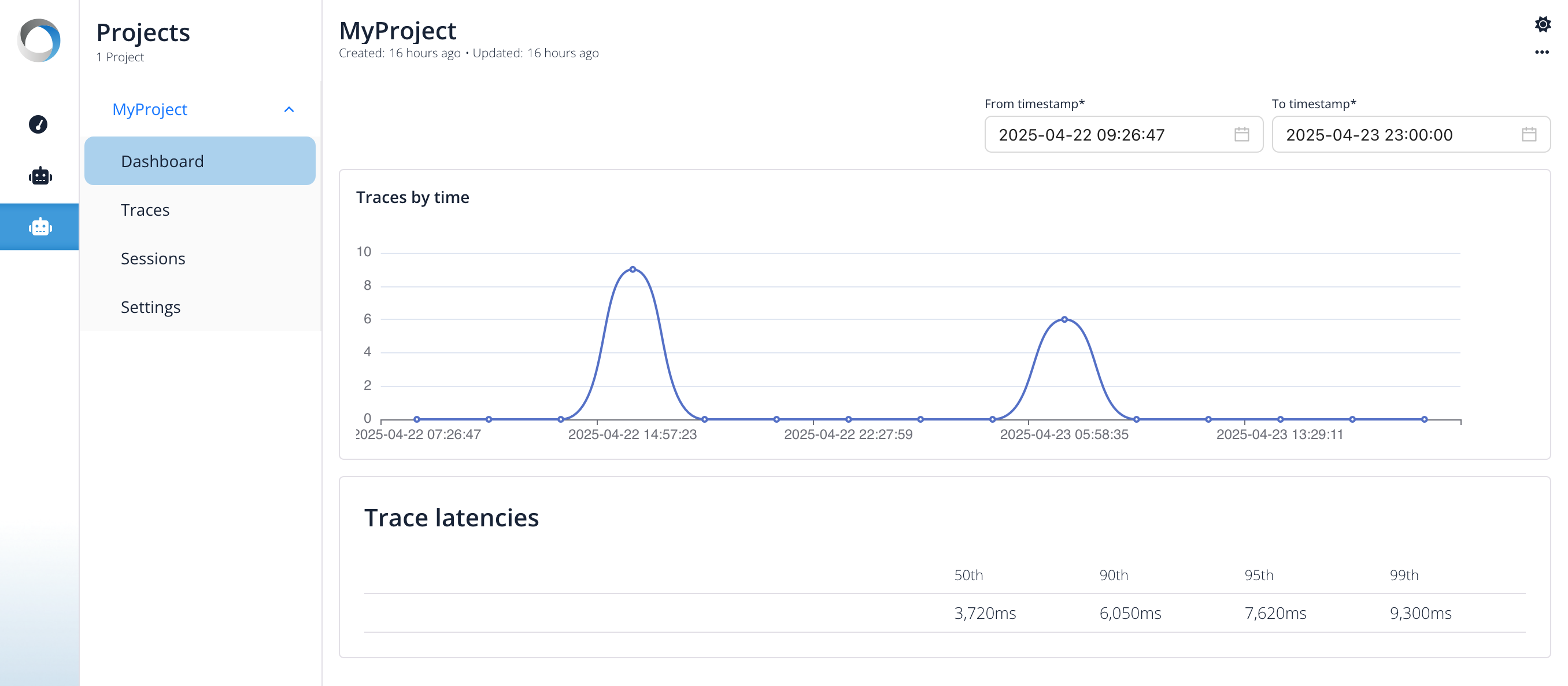
The Dashboard provides a high-level overview of the performance of your LLM application, focusing on latency metrics within a selected time range. You can adjust the from timestamp and to timestamp fields at the top to filter the data displayed.
The dashboard currently features four main components:
Traces by Time
This section features a line chart visualizing the number of traces initiated over the selected time period.
- X-axis: Represents time, spanning the duration selected in the dashboard's time range filter.
- Y-axis: Represents the count of traces recorded within discrete time intervals.
This chart helps you understand:
- The overall traffic pattern and load on your application.
- Peak usage times (like the spike shown around
2025-04-22 14:57:23in the example). - Periods of low activity or potential downtime.
Correlating this chart with latency metrics can reveal how load affects performance.
Trace Latencies
This section presents aggregated latency statistics across all traces recorded within the specified time period. It shows key latency percentiles:
- 50th (Median): The time it took for 50% of the traces to complete. In the example, this is 3.720ms.
- 90th: The time under which 90% of traces completed (e.g., 6.050ms).
- 95th: The time under which 95% of traces completed (e.g., 7.620ms).
- 99th: The time under which 99% of traces completed (e.g., 9.300ms).
This gives you a quick understanding of the overall responsiveness of your application.

Session Latencies
This table breaks down latency metrics per session. Each row represents a unique session, identified by its Session UUID. For each session, it displays the same latency percentiles (50th, 90th, 95th, 99th) calculated only from the traces belonging to that specific session.
This view is useful for:
- Identifying specific user sessions that experienced unusually high or low latency.
- Comparing the performance characteristics of different sessions.
- Debugging performance issues that might be session-specific.
For example, you can quickly scan the table to see if certain sessions (like the one starting with 90199272...)
have lower latency values (e.g., 3.540ms median) compared to others (like the one starting with 2f1f1594... with a 4.980ms median).

Span Latencies
While Trace Latencies give an overall picture, Span Latencies break down performance by individual operations or steps within your traces. Each row corresponds to a specific Span Name, which represents a distinct unit of work (like an API call, a database query, or a specific function execution).
For each Span Name, the table displays latency percentiles:
- 50th (Median): The median time taken for this specific type of operation across all traces.
- 90th: The time under which 90% of these operations completed.
- 95th: The time under which 95% of these operations completed.
- 99th: The time under which 99% of these operations completed.
This table is crucial for identifying performance bottlenecks. You can quickly see which specific operations (e.g., ChatOpenAI.chat or query_sql_db.tool in the example) are contributing most significantly to the overall trace latency or exhibit high variability.

Trace by Sessions
This image shows a horizontal bar chart titled "Traces by sessions".
Key elements:
- Purpose: The chart visualizes the count of traces associated with individual user sessions.
- Vertical Axis (Y-axis): Lists unique session identifiers (long alphanumeric strings like UUIDs). Four distinct sessions are displayed.
- Horizontal Axis (X-axis): Represents the number of traces
- Data: Each blue horizontal bar corresponds to a session ID, and its length indicates the number of traces recorded during that session.
- The bottom-most session has the highest trace count (5).
- The two sessions above it have roughly 4 traces each.
- The top session has the lowest count, with exactly 2 trace shown.
